Fiscus is a fintech company on a big mission with even bigger needs that needed to
first but completely understood in order for the operation to be carried out effectively.
Their goal is to merge everyday banking with investing from a small to large scale
accessible and easy to understand by everyone from all walks of life with varying
levels of experience, In order to do this we needed to focus on delivering and clearly
relaying information in the most visually pleasing but also consumable way possible.
This would most likely be the most challenge part as in the world of finance and also
cryptocurrency there is a lot of things people already dont understand and the click of
one wrong button could result in a lost for the user which adds another layer of risk we
need to be cautious of which really raised the test of creating beautiful but also making
something that was incredibly functional and fit for purpose.
The client wanted something that as mentioned was functional but something that gave
a feeling of affluence and wanted to try and step away from what could be considered
as traditional. Previous banking and financial apps have a seemingly high street style
which feels very commercial and familiar and that is obviously because of the banks
brands and history but they wanted to create something that felt forgien but exciting
and inviting using phrases like coming from out of space or alien.
SELECT RECIPIANT
REVIEW TRANSACTION
AWAITING APPROVAL
TRANSFER SUCESSFUL
BRIEF SUBMITTED SUCESSFULLY
THERE SEEMS TO BE A PROBLEM
INVESTING IN THE FUTURE
FISCUS BANKING
Team
Product Designer, Interaction Design
Visual Design, User
Research
Wire framing
Prototyping
Deliverables
Product Designer, Interaction Design
Visual Design, User
Research
Wire framing
Prototyping
Role
Product Designer, Interaction Design
Visual Design, User
Research
Wire framing
Prototyping
MAKING INVESTING IN THE FUTURE SEAMLESS WITH USER FRIENDLY DESIGN THAT ALLOWS THE CUSTOMER TO NAVIGATE FOREIGN TERRITORY WITH EASE AND FAMILIARITY


LETS REVIEW YOUR JOURNEY
HAND OVER COMPLETE, THANK YOU FOR YOUR CUSTOM
As mentioned when discussing the brief, we noticed from the offset that unlike
another project there would be more factors determined by risk that we would
have to account for because a flaw in design that wasn't accounted for would
inevitably become a problem for the user and then by default a problem for our
client so in order to mitigate this occouring we first had to thoughtfully brainstorm
and consider all issues that could arise due to poor visual communication on our
part.
Design is visual communication but it is easy to get lost in the beauty of your work
without considering human physcology especially when dealing with the emotions
related to finances and investing, This was our main driving force during our planning
stage and here are some of the questions we have to ask ourselves before putting
pen to paper.
When using a financial service, what range of emotions will a user be feeling
How can we simplify complex information without diluting the quality of it
What are the primary functions and main metrics a user would be looking for when
managing their account
How can we regulate customer behaviour by adding thinking time and preventative
measures without subtracting from the overall experience and required urgency
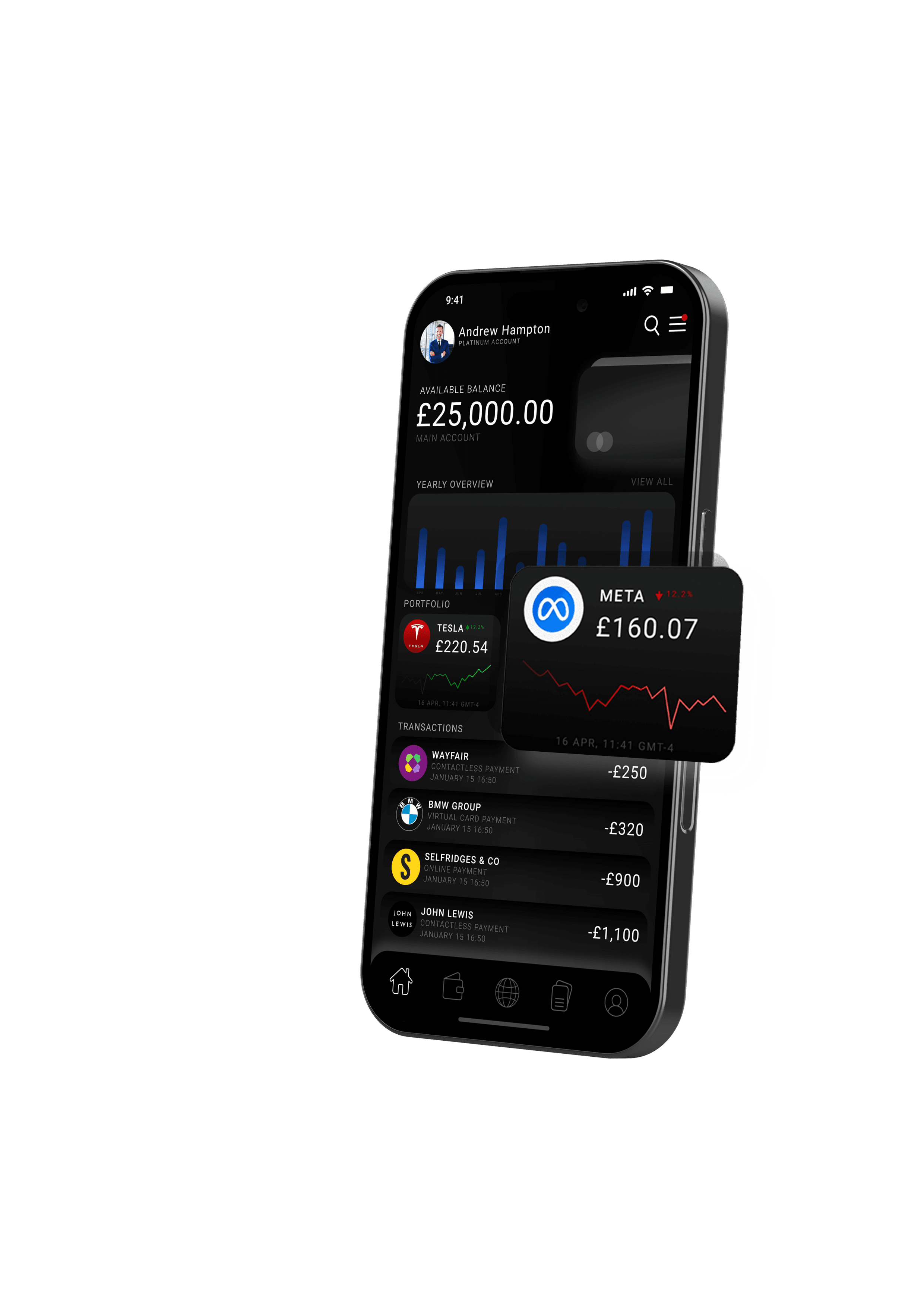
Based off of our initial brief and our own planning and collective effort we believe
we were able to create and present visually captivating solutions for the problem
our client had approach us with by using strong design cues that allowed us to
clearly communicate live market information combined with news and analytical
options to better allow our user to make choices informed by clearly displayed
metrics commonly used by traders.
By making the prices of assets prominent and the asset itself recognisable we
felt that the user would be more inclined to engage with these features and
further explore leading to more transactional volume for the platform. By also
clearly dividing assets by class this more easily allows the user to find what they
looking for easier.
A big choice we decided to make was to not add features like trending assets
due to market manipulation which was critical for the health of the client and
the longevity as platforms tend to promote other user activity and trending assets
which can be detrimental to an inexperienced trader.
I believe hindsight in a situation is the most ineffective thing which is why this project
went so well. We were adament the from the beginning we were going to consider
everything that this design needed at a foundational level to ensure that the clients
needs were more than catered to. This is a showcase of thoughtful and intuitive design
that encapsulated broad thinking married together with creative and functional building
to create a cohesive and effective product.
As a team we focused mainly on what was needed of us to build something that would
be a leader in its space and take over the market because of how it embodied the state
of mind that we understood the user has. It is a feeling of luxury giving the user a level
of accomplishment and seriousness which is vital for an investment platform. We wanted
to inspire confidence in the user by making them feel like they are using something that
normally they wouldve had to earn or be invited to use because of status of validation
through external bodies.
This app is an outstanding example of thoughtful and considered design.